Portfolio Breakdown:
Industrial Cleaning
Delis
& Wasp Management
TOTAL RELEASE FOGGER
(THROWBACK CAN)
While the perks of the job are cool as-is, the greatest privilege this gig affords is the opportunity to work on truly classic brands. Having grown up in a Total Release household — my father lived and died by it — I was thrilled when they announced an Original Recipe throwback can, honoring their return to 100% real cane sugar. “This is your grandfather’s Total Release!”
To ensure that our efforts were era-correct and true-to-brand, we were allowed access to the Total Release design archives, a climate controlled, white-glove facility in Saugerties, NY.
In its heyday, TR was a major breeding ground for all the design talent of the golden age of industrial cleaner marketing, so it was a treat to be given such unfettered access to the works that influenced so many of us. It was truly humbling to see the original Bulldog lithograph in person. “Blessed,” was the only thing I could say.
We all got stick and pokes that say it.
SIMONIZ
Industrial Wasp & Hornet Killer
The initial goal for this account was to develop a cheeky reinterpretation of Scandinavian minimalism through decidedly midcentury typeface accents, but the color quickly got away from us and engulfed the project.
Narrowing the options to this specific red (Millenial Cochineal, as some detractors have dubbed it) was, without exaggeration, a fourteen-month selection process followed by a gauntlet of internationally sourced print samples, just to find something that honored their vision.
We even brought in an optometrist from the Oxford School of Medicine to give a presentation on the color red’s interaction with our ocular cones as well as the brain chemistry behind the perception of “redness.” Simoniz is a real-deal brand and they were prepared to pay for real-deal research. You can see it in the final product. The resulting hue is sultry, enigmatic, pugilistic, and, dare we say, perceptionally fluid, existing in the negative space between the two nearest Pantone shades. Unclassifiable. And SIMONIZ wouldn’t have it any other way.
What was originally supposed to be a two-week process became a years long venture, proving just how hard it is to achieve perfection, and how easy it is to get sued for fraudulently inflated invoices.
You can say we’re blessed. We were gonna get stick and pokes that said it, but then we remembered we already did that.
BETCO x SUPREME
“Untouchable” Collab
I sat across the boardroom from the officers of BETCO, who were fully willing to walk away from the opportunity of collaboration, citing, “dilution of brand vision,” or something of that nature. “Fellas,” I said, “when Supreme calls you, two things happen. One. You pick up the receiver. Two. You say, “where do I sign?” *
While most BETCO drops are sold out in a matter of hours, with lines around the block at any Lowes or Home Depot, the two SoHo hardware boutiques stocking the Supreme x BETCO collab sold out in four minutes flat. Complex named it, “Floor Finish of the Decade” in their hardware polish roundup. We’re just honored to have been involved.
*There are actually other steps between one and two. For example, you have to know the phone number and dial it. Plus, you have to make sure that the right person is on the other line or else it can be bad or confusing. This is especially important in our industry where we can get anywhere from three to five phone calls in a single day.
BIG BOY DELI
This might have been the most difficult project we’ve ever undertaken. I don’t say that lightly, but it speaks to the peerless standards of their team. It’s why everyone wants to work with them!
While we ultimately lost the Big Boy account to the absolute hacks at a certain midtown agency, we are still very proud of what we accomplished prior to the split, including a cross-platform redesign of their entire brand footprint. We wanted the tenor of the signage to leave an indelible impression on the viewer; we wanted something truly, well, “BIG BOY.”
Our immediate influences on the project were, obviously, Le Corbusier, the Italian futurist movement, a Drake video I saw drunk, and a slew of international Bauhaus contemporaries. But after meeting with the brand creatives at BB, it was clear they were after something more bullish in the facade.
After a few sleepless nights with the protractor (Ableton crashed my Chromebook), we developed a fresh yet deconstructive approach to graphemic curvature. We’ve come to know the final typeface as, “Bruckheimer.”
But even with that under control, we were no closer to rounding out the rest of the larger brand identity. Days became months. Months became years.
After countless false starts, our design lead on the BB account hurled months of sketches, R&D, and mock ups on the floor and scrawled, on the board, “MANIFOLD. CHROMATIC. ASSAULT.” She received a round of applause and a bunch of us hugged. We had a direction.
What started as a maximalist approach to recontextualizing their culinary portfolio lead into an exploration of hookah branding, head shop LEDs, and street-facing collages of egg sandwiches.
I don’t know if I’d jump at the chance to land another deli, but I’m grateful for all that I learned in the process.
“Housewares, Dry Food, and ATM” Rebrand Campaign
99 PLUS
When 99p came to us, they were on their fourth creative director in three years, their branding was a mess, their in-house was imploding, and they were aching for a strategy that would translate to their clients.
They yearned for something that humans have always yearned for. They wanted to feel seen. They wanted to feel understood. Known.
That’s what we do here. We satiate the basest impulses of man and apply them to the brand. We listen for what isn’t being heard. We look for what isn’t being seen. We search for the yearning within the brand’s essence - the desire to feel known.
Their account was helmed by an ineffective organization that was refusing to honor the message that was lurking behind their mono numeric alias…
“Variety.”
Industry Luminaries and Towering Giants of the Saltine Universe
KRISPY ORIGINAL SALTINES
KO was another pinch me moment for the entire creative team at OALcNSP. They have always been at the forefront of ‘subversion in plain sight’ style industrial design. They don’t get the credit for it, but they essentially invented packaging-as-protest.
The last century is riddled with epoch-defining examples of Krispy Original’s take on the cause of the day: the Mao Tse Tung wrapper, Tomb of the Unknown Saltine, The Guantanamo series that was famously snubbed at Cannes Lions 2004…
But this may be their magnum opus. From the placidity of their near-featureless branding to the intentionally trite approach to kerning and logo alignment— all of it obscuring the Orwellian and Sauronesque ‘all seeing’ eye of todays NSA, as well as the more menacing tide of voluntary personal surrender brought upon by the irrepressible deluge of social media platforms that sprout up year after year.
As is well documented, all of our interactions with the reclusive Krispy Original artists were facilitated through ornate, gilded notes, handwritten in fountain pen, left on our desks, each day before sunrise.
To this day, we have never met with them face to face.
Knowingly.
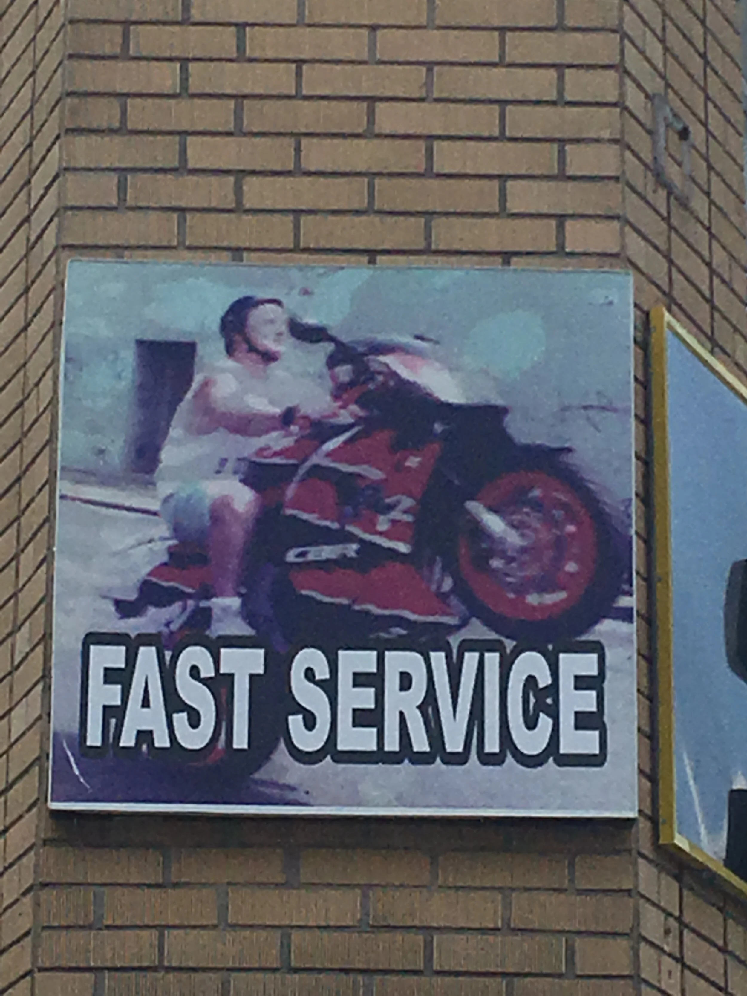
FAST SERVICE
After a night of keeping up with my co-founders profoundly chill drinking habit, wherein I kept pace, going Recess for Recess, the topic of science came up, because it’s a very chill thing to talk about.
From that evening came an interesting challenge - and we decided that FS was the ideal account for it. Our goal was to back up every design move with exhaustive field research and data analysis.
For the F/W 2020 Fast Service campaign, we commissioned a top psychoanalytic market research firm to conduct a sweeping seventeen-month inquiry into the correlative interaction of text and image. Obviously we missed the original deadline by nearly a year and we got sued again, hard, but such is the cost of scientifically-backed product refinement.
Through the use of next-gen CTE scans and brainwave analysis, we were able to arrive at the most potent combination of prose and narrative. The researchers monitored sections of the brain related to exhilaration, excitement, and overall arousal.
For those skeptical about the marriage of science and design, we were able to get as granular as the angle on the motorcyclist’s shorts, and, millimeter-by-millimeter, where the jorts fell on the thigh to elicit the optimal consumer response.


